J.me

Refreshing blog, new design and new domain

It has been a while since the last time I change the design of this blog, it is almost three years ago. The web landscape has been changed rapidly since then, with HTML5 becoming more standard and CSS3 is more supported, that made my old design outdated. So the thought came to me, it is the time for a new design.

blog-redesign1

Also with this opportunity, I also introduced a new domain for this blog, jeffri.me. Starting today, jeffri.me is the default domain for this blog, while my old domain – jeffri.net – will redirect to this new domain. In case you are wondering, why did I change a dot net to dot me, well, no specific reason. I just feel like it, it’s shorter by one letter and it’s more personal. Β πŸ™‚Β Besides, it’s not like my old domain ranked high, although it’s 5 years old now. I will keep jeffri.net for as long as I live though.
Responsive layout testing

While working on a responsive website, testing it could be tricky. The usual way (and effective) is to resize the browser window and there’s many plugins on the browser that do just that. Another way is to use an available tools on the web, many of these are awesome, like The Responsinator and Screenqueri.es. Another one that is also my favorite is RWD Bookmarklet by Victor Coulon.

These were all cool and I frequently used it. However, these tools were made for testing on mobile and tablet display resolution, what if, you want to test a laptop or desktop resolution as well? In my case, I have 1280×800 laptop, so I never knew how the website will look on higher resolution screen. There’s also many display resolution on mobile now to consider, not just iOS resolution.

And so I created a simple tool to test responsive website, with a wide range of resolution to select, from mobile to tablet to desktop. Also HDPI display is common now, so I added a device pixel ratio selection that calculate the effective resolution. For example, Motorola RAZR have QHD display with pixel ratio of 1.5, so the effective resolution is actually 640×360, that is the resolution the phone display on it’s browser.

Feel free to use the tool here: responsive.jeffri.net

A little bit of disclaimer, I don’t store any data from your usage. There’s no trip to the server when you use it, at all. πŸ™‚

Hope you find it useful! Cheers!

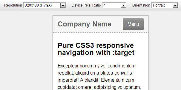
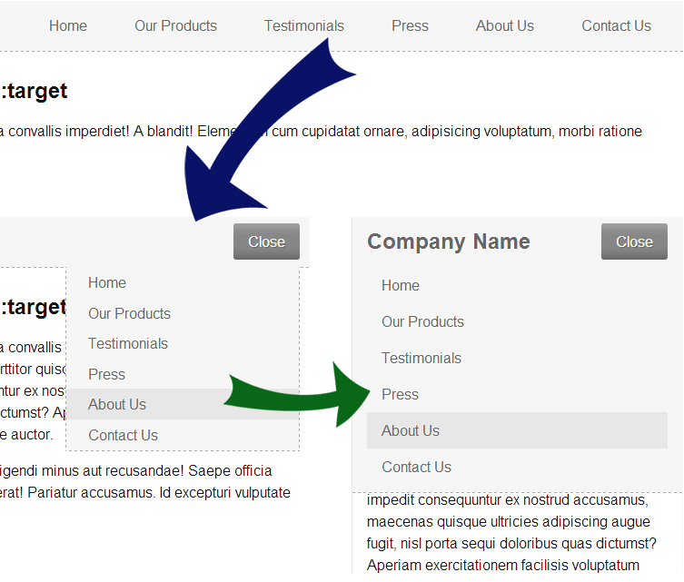
Pure CSS3 responsive navigation with :target

This is an experiment I tried when working on WPMUDEV mobile navigation a while back, basically to make the navigation work with CSS alone. Using :target pseudo-class, this is possible, but of course it won’t work very well on every navigation.

For the sake of this demonstration, I have made a responsive navigation that will scale between smartphone, tablet and desktop.

Background image on table row

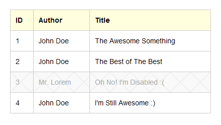
Applying a background image on table row is a classic issue that never get right, at least not in a first few pages on Google search when I looked on a solution. In fact, the only cross browser solution is to apply the background to the table cells instead. But what happen if you want a repeated background across the table row?

The problem

Let’s say you wanted to apply a background to a row that has disabled class.

The CSS:

table tr.disabled {
	background: url('disabled.png') repeat-x;
	color: #aaa;
}

Result:

Ouch! The background is in fact applied to the table cell, not the table row as we intended. It looks ugly as the image start in every cell!

Simple jQuery and CSS3 Slideshow Tabs

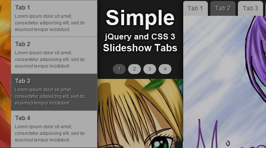
A slideshow and tabs is pretty common nowadays in any modern website. There is a ton of way to do this and many free and paid tools available for this feature. This make it very easy to create and it will always amaze people who see it. Basically, we will need at least Javascript to do this, CSS to style the slideshow and tabs as we wanted, and then finally the special HTML markup which make it possible. There is also a slideshow which make use of Flash.

The solution I tried to made right now is a very simple and basic one. It make use of simple jQuery to catch the click event and switching tabs, as well as the slideshow, the CSS to style it as much as we wanted and a simple HTML markup in one unordered list.

Blog redesign

Welcome to my new redesigned blog! It’s been a year and a half since the last time I changed the design. I have always wanted to change it, but I just always don’t have enough time. πŸ™‚ I know I’m not that good enough in designing, but at least, this is the best design I ever made until now!

The idea behind this design is, to make a simple, usable layout and still looks beautiful. There is a lot of tutorial on the web that helped me when making this. I try to make the website small in size, so you’ll able to load it fast enough. There is also a cool trick on the background, which still make the markup small without much wrapping div over div to accomplish the effect. I also realize the importance on social networking nowadays, so I add links to some of my account. πŸ™‚

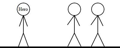
Moving Stick Figure with CSS 3 and jQuery

With CSS 3, creating a stick figure is easy and fun. But it is even better if it can move. So here it is

Click here for the demo.

This currently worked on Google Chrome and Safari. However, in my test, Safari lagged a lot in the animation. So Google Chrome performed the best!

Enjoy… πŸ˜€

Update: This is also submitted on Smashing Magazine CSS 3 Contest, you can preview and download from there too. πŸ™‚

Pure CSS Dropdown with a Little CSS 3 Juice

Menu dropdown is one of the feature that almost every today webs have and it is one of the most popular feature used in the web. In past, such feature need Javascript event. Such as using onMouseOver or onMouseOut event. However, since CSS introduced, the new psuedo classes now have this ability. Also, this solution is work for all major browser, except, of course for the CSS3 juice added, which is currently only worked on web-kit browser such as Chrome and Safari. πŸ™‚

A little guide of using jQuery

JQuery is Javascript library that can help you write code smaller and easier to take a good care of event handling, animating, AJAX and more. With jQuery, we can make our webpages more beautiful. You can see that I used it for my side menu here. πŸ™‚

This article didn’t intend to teach you how to became the jQuery master and I’m far away from a master. It just for the case you didn’t know about jQuery yet and want to start with it, then this will be a good guide for you. If you want a more complete tutorial, go to the jQuery documentation.