It has been a while since the last time I change the design of this blog, it is almost three years ago. The web landscape has been changed rapidly since then, with HTML5 becoming more standard and CSS3 is more supported, that made my old design outdated. So the thought came to me, it is the time for a new design.
Also with this opportunity, I also introduced a new domain for this blog, jeffri.me. Starting today, jeffri.me is the default domain for this blog, while my old domain – jeffri.net – will redirect to this new domain. In case you are wondering, why did I change a dot net to dot me, well, no specific reason. I just feel like it, it’s shorter by one letter and it’s more personal. 🙂 Besides, it’s not like my old domain ranked high, although it’s 5 years old now. I will keep jeffri.net for as long as I live though.
The abandoned design
Honestly speaking, the thought of a re-design has been came to my mind about 2 years back, just a year after the old design launched. I even started to make the design in Photoshop. The goal is to make a more simple design, though I got stuck and abandoned it in the end. Here is how it looks like before it’s buried deep down.
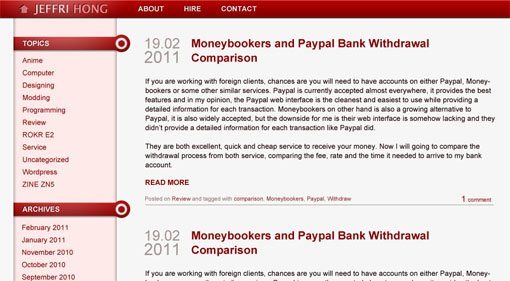
It’s following the red scheme that I always used since this blog started. Half a year later, the thought of a re-design came again. This time, it’s more serious. 🙂
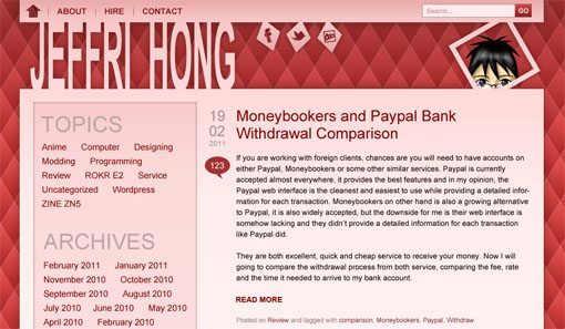
Still following the red scheme, this design is more on the weird end, but I pretty liked it, even today. Unfortunately, due to the work load and less time to spend to work on this, it’s getting abandoned again. I even started to code it, but there’s another reason why this design didn’t work out. It looks good on Photoshop, but when on the web, it doesn’t look as good.
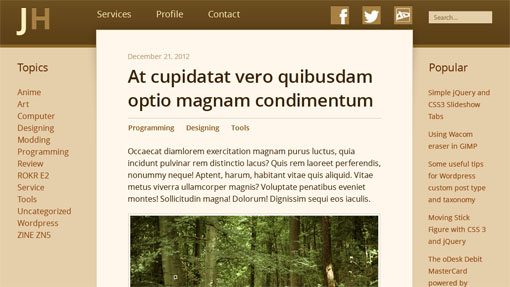
Finally, the espresso
It’s in December 2012, another thought to a new design came again. Finally, this is the one that get to see the light. I took a different direction this time, code-named Espresso, the new design is not following red scheme anymore, it is now brown. It’s coffee-like color, so thus, is named Espresso. And yes, of course the reason of this change in direction is because I loved coffee myself. 🙂
This new design is following the responsive website trend, just resize your browser window when viewing this, and see how it changed to adapt to the new viewport. It should looks great on your desktop, tablet and even on mobile. And it’s really light-weight as well, with only one 2kB image file to load, one CSS file and one JS file (not counting those added by plugins).
As for typography, I opted for Open Sans. And on Incsub, we embraced the use of baseline grid to improve the vertical rhythm, which I also used on this design.
Well, that’s all for a bit of behind story on this re-design. 🙂 Cheers!
4 comments | Leave a comment