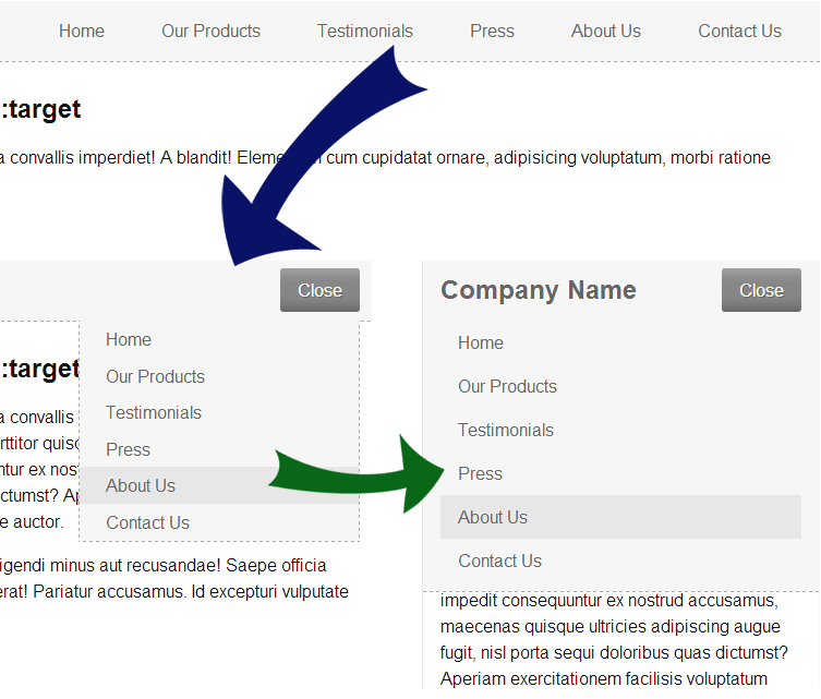
This is an experiment I tried when working on WPMUDEV mobile navigation a while back, basically to make the navigation work with CSS alone. Using :target pseudo-class, this is possible, but of course it won’t work very well on every navigation.
For the sake of this demonstration, I have made a responsive navigation that will scale between smartphone, tablet and desktop.

The navigation
First, let’s begin by writing the HTML for our navigation.
<header class="top"> <h1 class="logo">Company Name</h1> <div class="main-nav" id="nav"> <a href="#nav" class="nav-open">Menu</a> <a href="#" class="nav-close">Close</a> <nav> <ul> <li><a href="#">Home</a></li> <li><a href="#">Our Products</a></li> <li><a href="#">Testimonials</a></li> <li><a href="#">Press</a></li> <li><a href="#">About Us</a></li> <li><a href="#">Contact Us</a></li> </ul> </nav> </div> </header> |
It’s pretty straightforward, with logo and navigation both wrapped in a <header>. Notice that we have two links on div#nav, both act as the navigation toggle on phone and tablet. The navigation is a standard <nav> with unordered-list of links.
Next, let’s begin by adding some CSS.
body { font: 100%/1.5em Arial, sans-serif; color: #121212; margin: 0; padding: 0; } .top { position: fixed; top: 0; left: 0; right: 0; background: #f6f6f6; border-bottom: 1px dashed #aaa; padding: 0 1em; min-height: 3.5em; } .logo { float: left; font-size: 1.5em; line-height: 2.3em; color: #666; margin: 0; padding: 0; text-shadow: -1px -1px 0 #fff; } #nav { text-align: right; } #nav > nav > ul { list-style: none; margin: 0; padding: 0; } #nav > nav > ul > li { display: inline-block; } #nav > nav > ul > li > a { display: block; color: #666; text-decoration: none; padding: 1em 1.5em; text-shadow: -1px -1px 0 #fff; } #nav > nav > ul > li > a:hover { background: #e7e7e7; text-shadow: -1px -1px 0 #f2f2f2; } |
We make the header fixed position here, with logo on the left. The navigation is now styled and will work well on desktop. We also use inline-block instead of float on <li>, so yeah, we are not targeting IE7 and below. Note also the use of direct children selector instead of standard descendant selector, direct children is quicker so it’ll help when things start piling up although it won’t make any differences in this demonstration. 🙂 Here is how it currently looks:

Now, we’ll use some media query, but before that:
.nav-open, .nav-close { display: none; background: #878787; color: #fff; margin: 0.5em 0; padding: 0.5em 1em; text-decoration: none; border-radius: 3px; text-shadow: 1px 1px 0 #666; box-shadow: inset 0 10px 15px -5px #a6a6a6, inset 0 -10px 15px -5px #666; } |
We add some styling to the navigation toggle and default it to display none.
And here is the tablet navigation CSS:
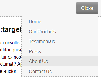
@media only screen and (max-width: 60em) { .nav-open { display: inline-block; } #nav:target > .nav-open { display: none; } #nav:target > .nav-close { display: inline-block; } #nav > nav { position: relative; text-align: left; } #nav > nav > ul { position: absolute; top: 0; right: 0; width: 100%; max-height: 0; max-width: 16em; background: #f6f6f6; border-width: 0 1px 1px 1px; border-style: dashed; border-color: #aaa; overflow: hidden; -webkit-transition: max-height linear 0.5s; -moz-transition: max-height linear 0.5s; -ms-transition: max-height linear 0.5s; -o-transition: max-height linear 0.5s; transition: max-height linear 0.5s; } #nav > nav > ul > li { display: block; } #nav > nav > ul > li > a { padding: 0.3em 1.5em; } #nav:target > nav > ul { max-height: 400px; } } |
You’ll see that we now set the .nav-open to display by default, and use #nav:target to display the relevant navigation toggle. We also want the tablet navigation to display in a dropdown, so there you see the relative and absolute relation on <nav> and <ul>.
Notice that we use max-height for toggling navigation and on transition animation, this is needed since we can’t animate height that set to auto, so max-height do the trick. Note that you’ll need to make sure the max-height is bigger than your navigation but still not too big as the animation will be delayed, so you’ll have to find a perfect balance on that.
As for the media query, we make this rule apply on screen less than 60em, in this case, it’s 960px (since the font-size is 16px). The reason we use em rather than px is to make the responsive work even if the user browser have different zoom level.

Finally, the phone navigation, as follow:
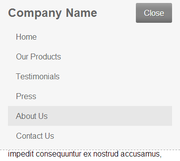
@media only screen and (max-width: 30em) { #nav > nav > ul { position: static; max-width: none; border: none; } #nav > nav > ul > li > a { padding: 0.5em 1em; } #nav > nav > ul > li:last-child { margin-bottom: 0.5em; } } |
We return the <ul> to static position, remove max-width and border. We also adjust the padding, and then add a margin to the last-child of <li>. We use max-width of 30em for our media query here, or 480px.

Now the navigation is finished. Click the link to the demonstration below to see it. 🙂
Drawback
Obviously, we can’t use this :target selector on every navigation, especially on side drawer pattern. The top drawer pattern, as demonstrated here can work well, but still some limitations apply:
- Every click on the toggle will add to your history (might be a good thing if you like the ability to use back key to close navigation, but in general, no)
- You can access the navigation directly by typing the URL, might not be a good thing either
- If you use fixed position like I did, you’ll have very limited height on your navigation
In those cases, we’ll need some Javascript to help here. 🙂
Final words
Well, as far as browser support, I think it work pretty well on every browser I can test on my Android device. Still, this is experimental and might only be suitable in some cases. I think, it will be very cool for a fallback whenever Javascript is unavailable, so your navigation will still work even if user disable it or when there is some code error. Otherwise, use Javascript to catch touch/click event as it will be more superior. 🙂
Thank you for reading!
No comment yet